It’s a question I’ve wrestled with countless times in my career: should I ship this just to meet a deadline, just to get it out there? Or should I wait, hold back, and build something I’m genuinely proud of?
Something that I love, that speaks to craftsmanship, that’s more than just functional — it’s delightful ✨. t’s a decision that goes beyond mere deadlines, and at times, it’s not even metrics-driven. Instead, it becomes a question of personal satisfaction and a sense of craft.
There are moments when I’ve built something with features that weren’t necessarily there to “move the needle” in terms of metrics. They weren’t part of the design spec or handover files, and no one asked me to build them.
Sometimes, they’re small touches—a smooth animation, an Easter egg that someone might stumble upon—and yet, they feel important. They may not directly increase engagement or user retention, but they add a bit of magic 🪄.
And for the user who finds that detail, there’s a moment of joy, a personal connection that you can’t always measure ❤️.
But does this emotion-driven aspect of quality justify delaying a product’s release? Does it override the need for speed?
How do you decide what to choose and prioritize?
I wish the answer was simpler. But as I’ve come to realize, it’s not a binary choice; it’s a nuanced and complex balancing act. There’s no universal formula to decide whether to prioritize speed or craftsmanship—it depends heavily on the context, the product, the team, and the stakes at hand.
I often find myself staring at my work, grappling with the question: “Is it good enough to go live?” I could tweak and perfect it for hours—maybe days, or “Hey, I can make this perform much faster!”.
On the contrary, There’s sometimes this voice in the back of my mind saying, “Ship it now, and polish it later.” Sometimes, this makes sense. You’ve got to meet deadlines, keep momentum, and avoid getting stuck in a perfectionist loop.
But then, there’s the other side of me that wants to wait—wait until the product feels just right, until it’s not just functional but something I genuinely love. I’m a firm believer in craftsmanship, in building something that feels intentional, delightful, and above all, feels human. (why ‘human’ and not ~user`?)
For example, sometimes I’ll add a small detail—an animation, an easter egg—that I know won’t drastically move the needle on metrics, but I’ll do it anyway because it adds a personal touch, an emotion and because I love doing it ❤️.
There’s this satisfaction I get from knowing that someone, somewhere, might stumble upon it and smile. Does it enhance the product metrics? Maybe, maybe not. That’s hard to measure. But it feels right.
So, how do you decide what to pick?
I wanted to have this sort of decision-making framework for myself which would help me in answering these questions, and that’s what I wanted to share/talk about, in this blog. Here’s what I’ve come up with and what resonates with me the most
Product Quality > Velocity > Code Quality
Let me elaborate on the thought process behind this and why I thought of breaking down quality into these two areas.
Product Quality
For me, this is the highest priority. Product quality is about the experience we’re building for people—the thing they touch, see, and feel. It’s not just about whether it works, but how it works.
Is the experience seamless? Does it solve the problem elegantly? Are there moments of delight, or does it feel like a utility that’s only there to get the job done?
If it’s not there, I don’t feel comfortable shipping it, even if it means missing a deadline.
Let’s take a look at this with an example
This is actually the current task that I’m working on 😛. So, let’s say that you’ve been given a Figma link with two dialogs/modals that you need to build, primarily for login and signup functionality.
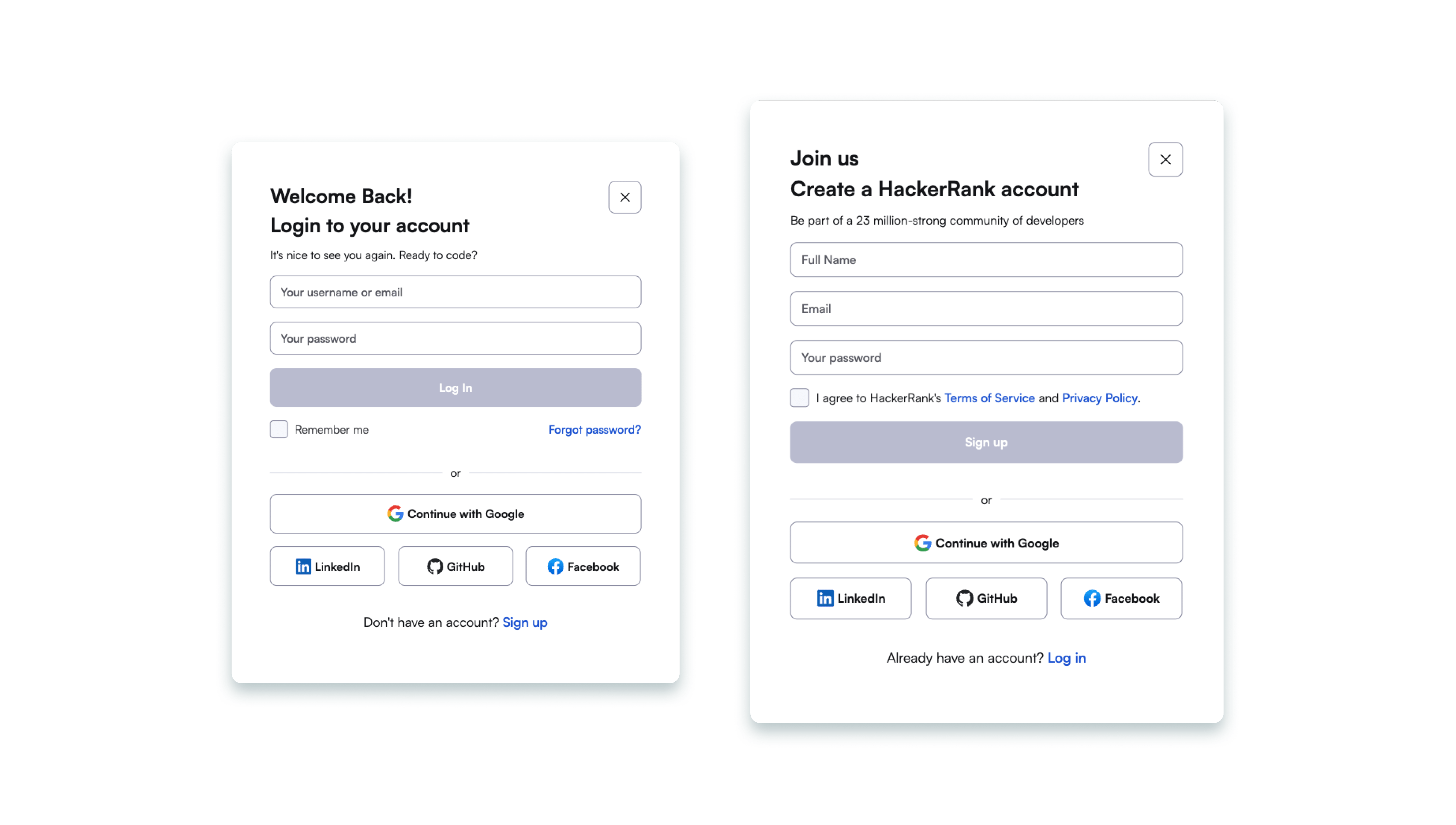
The one on the left is for logging in, and the other one is for user signups. As a developer, if you just follow the design handoff file, you might end up with something like this 👇🏻
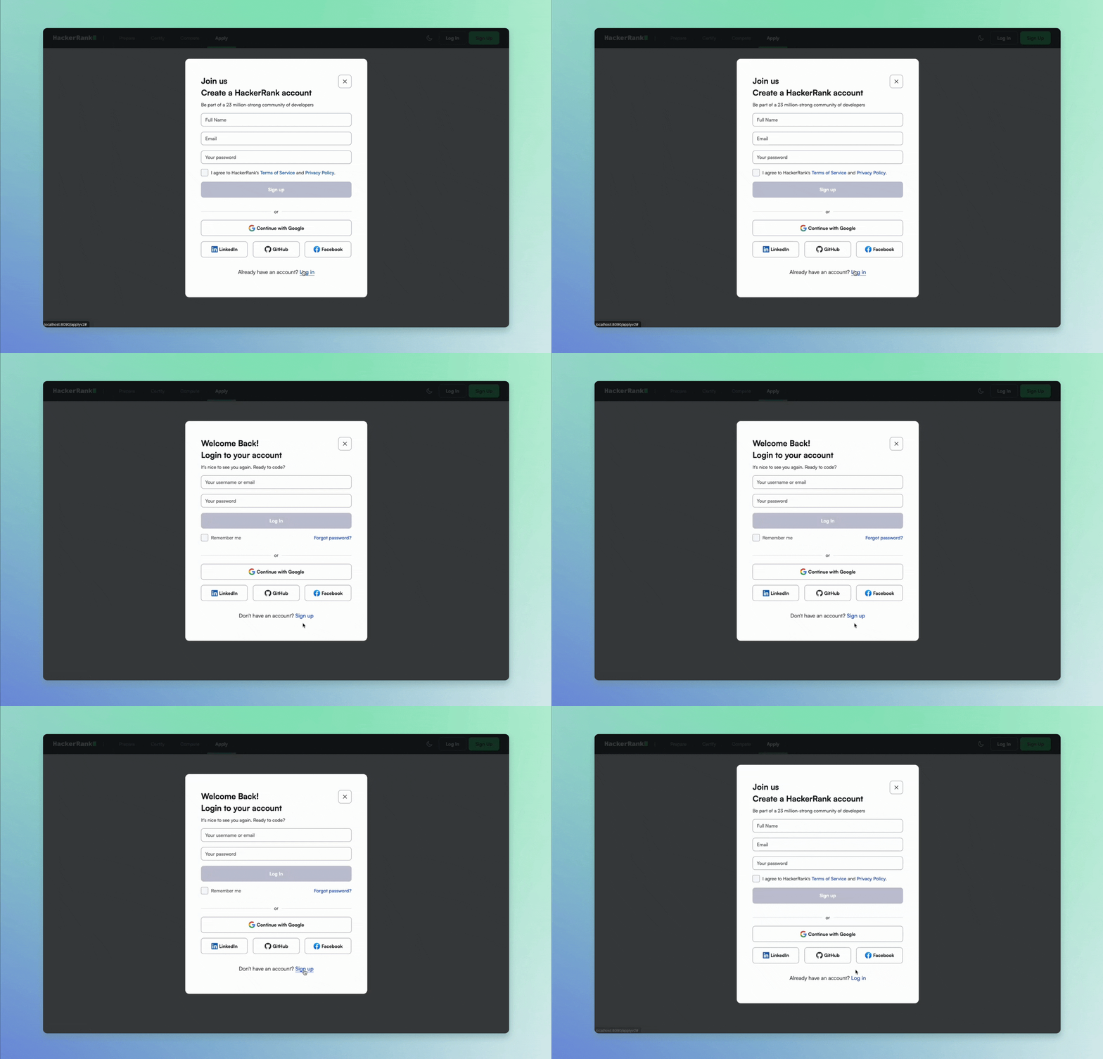
Now, there’s nothing wrong with this, and it absolutely works! All the functional requirements are being taken care of ✅.
But doesn’t this transition feel a bit abrupt? 🤔 Something seems to be missing. It lacks the finesse that could elevate the user experience. Also, there’s this weird ‘flash’ that occurs whenever I switch between the dialogs.
How can we take this a step further/improve this?
If you look closely, you’ll see that most of the layout between these two dialogs is quite similar, with the only difference being the addition of an extra field. There are also a few elements, such as the social login buttons, that remain fixed.
So, what if we combined these two states into a single dialog? Let’s give it a try.
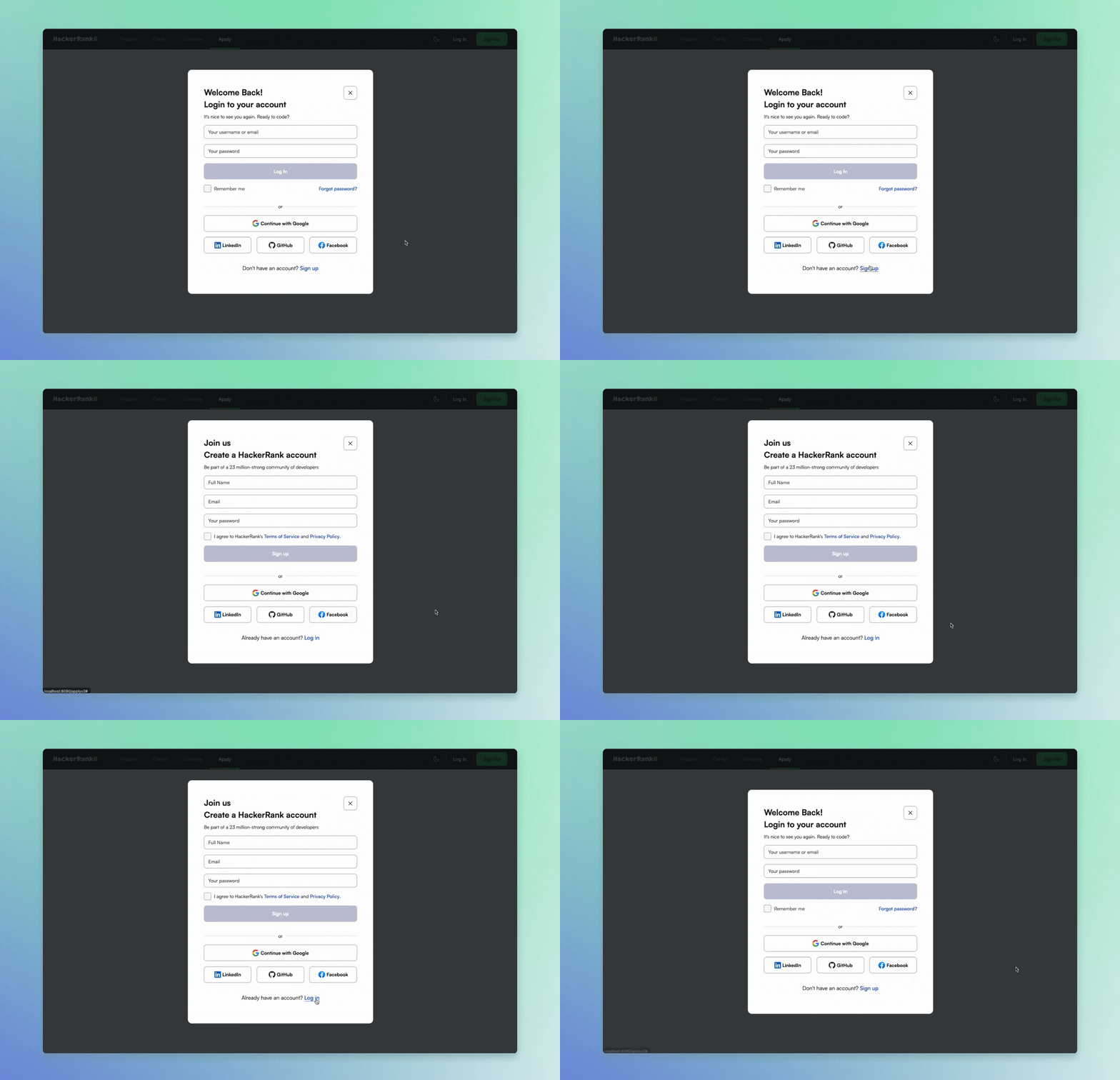
Hmm, feels better doesn’t it? This change also resolves that annoying ‘flash’ issue! :)
But let’s not stop there. We can enhance it even further by animating the container height, which will create a more fluid transition.

Voila! This is already looking much better! ✨ The height transition feels so natural. Now, let’s consider adding a subtle animation to the text headings and footer text as well. That little touch would elevate the overall experience even more! :)
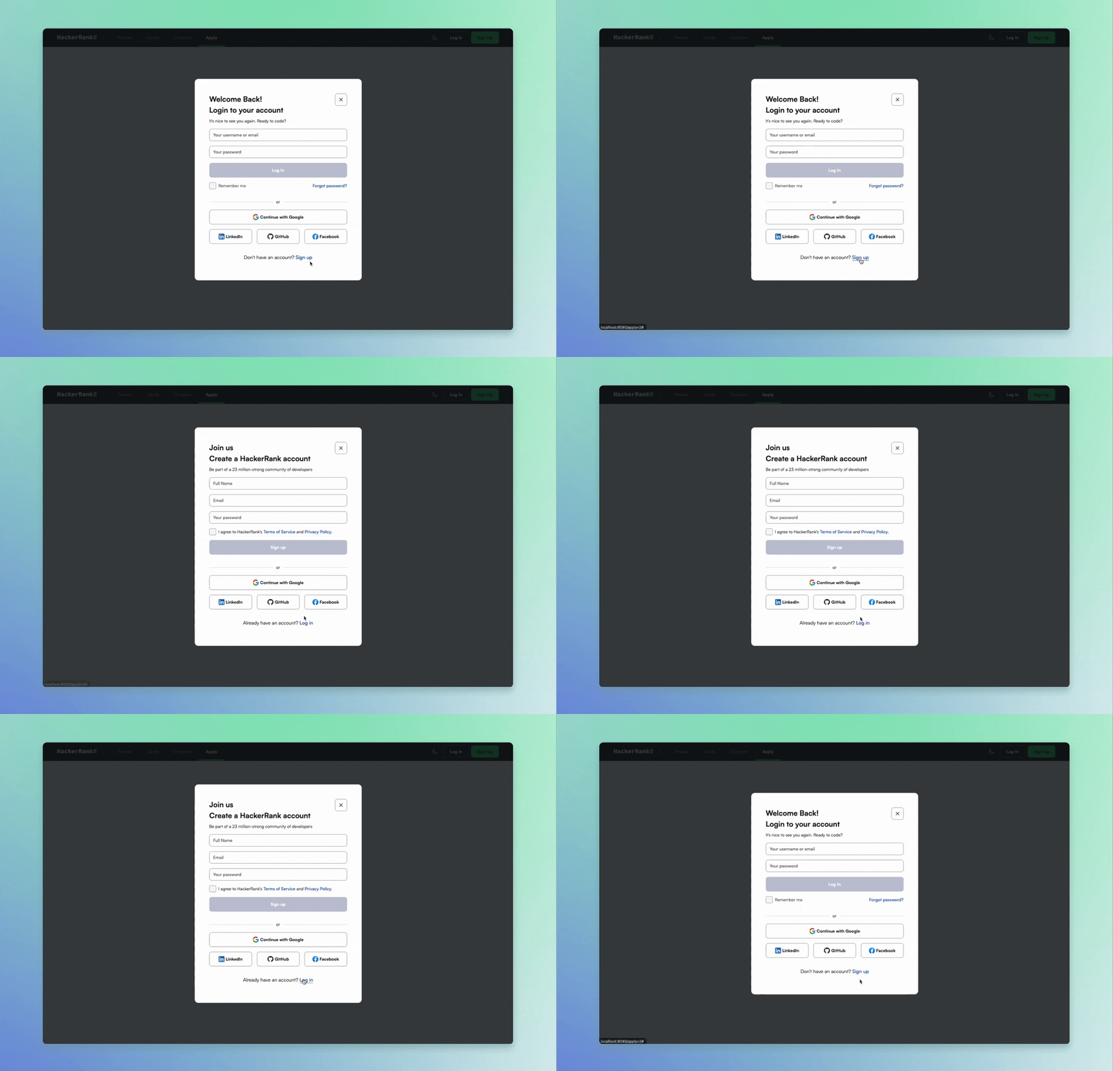
We’re almost there! :)
What else can we do? Let’s put ourselves in the users’ shoes. The primary goal of opening or switching between these dialogs is to either log in or sign up. The way users might achieve this is by typing in their information or clicking one of these buttons.
So, why not autofocus the keyboard on the first input field?
Additionally, since this is an authentication dialog where we’re asking users to fill in or create a username and password, let’s add autocomplete='current-password', autocomplete='new-password'. This will make it easier for browsers and password managers to assist users during the sign-in or sign-up process. You can learn more here
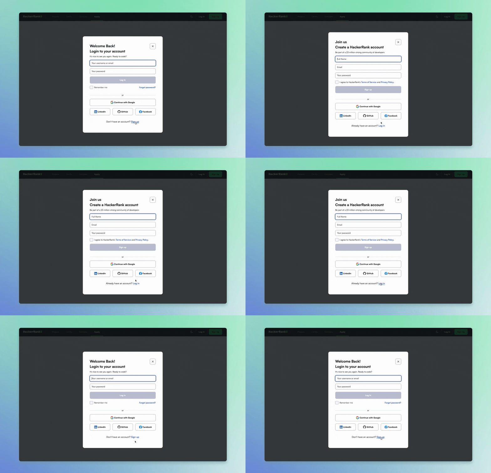
Perfecto! ❤️ Notice how the fields are automatically focused while switching! :) Now, all your password managers and browsers should be able to detect the fields!
If we go a step further,
we have these social authentication buttons, and currently, we offer four options, which might be a little overwhelming for users at times. What can we do?
How about saving their last used social provider in local storage? The next time they try to log in, we can highlight that one! :)
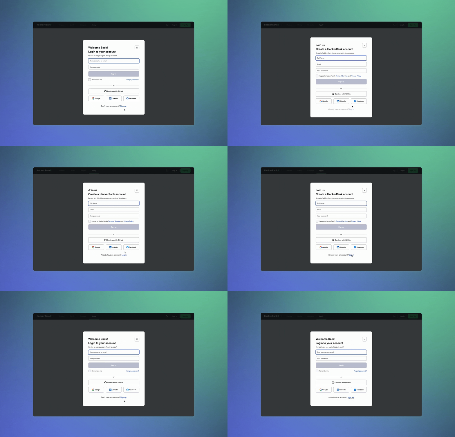
Of course, there are many more enhancements we could implement, but this is just a small example of what we mean by product quality. Even these minute details, which most users might overlook, significantly impact the overall delight factor.
One of my personal favorites is a project management tool called Linear. Take a look at this interaction: when you try to create an issue with the prefix ‘Fix:’, it automatically suggests a label.
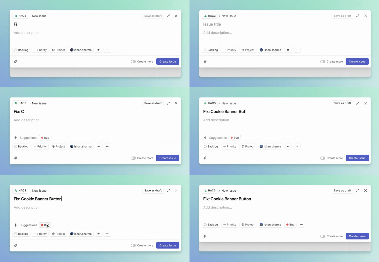
Who even thought of this? It’s these thoughtful touches that require extra care and often involve thinking from the user’s perspective.
In the end, we’re all human, and it’s our collective appreciation for creativity and craftsmanship that unites us :)
Velocity
In our framework, product quality always comes first, but I’ve also learned that, in the world of product development, speed can be a game-changer.
There’s a rush to ship fast, get features into users’ hands, and gather feedback as soon as possible ⚡️. It’s not just about hustle; it’s about testing ideas in the real world and seeing if they stick.
But velocity doesn’t mean recklessness; it means being nimble. There’s an art to moving fast while still keeping your focus on what truly matters. In many cases, speed is about gathering real-world data to determine if you’re even on the right track.
For example,** when building an MVP, velocity is your priority. The goal isn’t perfection; the goal is to figure out if this idea has legs. Does it resonate with your audience? Does it solve a problem well enough for users to care? Will it lead to PMF (Product-Market Fit)?
In these cases, you can’t afford to spend days or weeks polishing animations or optimizing code. You just need to get it out there and start learning.
However, Just because you’re experimenting or testing an MVP doesn’t mean it should feel rushed or clunky. A fast iteration cycle shouldn’t come at the cost of the product feeling incomplete.
I don’t think I can put it better than Hari, though. This is what he has pinned on a memo board at his desk in the office:

Take the login and signup dialogs example from earlier—if I were aiming for speed, I’d skip adding extra animations or complex features like saving the last used social login option. But I’d still make sure that the transition between the dialogs feels smooth and the overall experience is cohesive.
Velocity is about smart compromises. You focus on delivering the core experience that users need while leaving the extra flourishes for later. It’s about cutting back on the non-essentials, but still maintaining enough finesse that users aren’t turned off.
When you’re building an MVP, the goal is to test quickly, but you’re still creating something people will interact with—so it has to work well and feel intentional.
But—and this is the tricky part— it’s easy to fall into the trap of thinking everything needs to be fast. That’s where balance comes in. Not everything can be MVP’d, and some features need more time and attention.
So, how do you decide when to prioritize velocity over product quality? Well, I try to do this by asking myself a few questions:
- Is this feature critical to user experience, or is it just a test/experiment?
- Is it going to last for a longer period? (usually more than a few months)
- What are the stakes if it fails?
- What’s the cost of waiting versus shipping?
Code Quality
For me, code quality comes after product quality and velocity in my decision-making framework. That might sound strange, especially as a developer—after all, we’re taught that writing clean, maintainable code is essential.
And it is essential. I’m not saying code quality doesn’t matter. It matters a lot. But if it’s a choice between shipping something that improves the user experience or spending extra time refactoring to make the code perfect, I’ll choose to prioritize the product and the user.
However, I tend to see code quality as a byproduct of caring about what you’re building. When you truly care about delivering a great product, you’ll naturally want to write cleaner, more maintainable code.
Code quality becomes an extension of product quality. It’s hard to put in extra effort into the user experience while completely neglecting the code that makes it all possible.
But, and this is a big but—it depends on the context. If you’re building an MVP, where speed is of the essence, velocity should absolutely be your priority. Your goal here is to achieve Product-Market Fit (PMF), to validate whether your idea even works.
You might not know if this product is going to exist six months down the line, and if that’s the case, over-optimizing for code quality just doesn’t make sense.
There’s no point spending hours writing perfectly clean code for something that might get thrown away. I’ve been there too—building an MVP for this Resume Builder, where time was everything and we ended up shipping a decent enough product with bad code quality, sometime later we realised that the idea worked and this year, we’ll be starting a workstream to clean up the code and build it in the right way.
In those cases, you ship fast, you learn fast, and maybe the code isn’t the prettiest under the hood, but that’s okay. You’re not writing a masterpiece; you’re running an experiment.
Once you start scaling and know your product has legs, that’s when you shift gears. You start caring a lot more about code quality because now, maintainability and scalability matter.
You don’t want to be in a situation where your product is growing, but your codebase is crumbling beneath it. That’s when tech debt becomes a real headache.
To summarise,
It’s about balance. Writing good, clean code is like building a sturdy foundation—it’s going to help us maintain and scale things down the road.
It’ll make future work easier for the next developer (or for me a few months later when I’ve forgotten how everything works!). But at the end of the day, users don’t see your code; they see the product.
Conclusion
At the end of the day, it’s all about balance. Building great products requires making tough decisions between quality, speed, and code craftsmanship. There’s no one-size-fits-all answer to the question of whether to prioritize velocity or polish, but having a clear framework can help guide the way.
In my experience, focusing on Product Quality first ensures that what you’re building truly serves and delights users. But at the same time, Velocity is essential for testing ideas, getting real-world feedback, and iterating quickly. Code Quality, while crucial for long-term success, can often take a backseat during early stages when speed matters more.
The key takeaway? Don’t be afraid to make smart compromises. You don’t have to polish every detail when shipping early, but maintain a baseline of quality that reflects your care and craft. And always keep in mind: users see the product, not the code behind it.
Make sure the experience feels intentional, even when you’re moving fast.
It’s a nuanced balancing act, but with a thoughtful approach, you can ship fast, iterate quickly, and still build something that feels delightful and human.