As a developer,
Why should you even care about design?
Design is a crucial part of any digital product. Designers are responsible for the look and feel of an application, which is what makes it stand out from other similar applications.
Generally, The design process can be long and complicated but I feel that as a developer it’s important for us to understand the principles of design because believe it or not it can actually have a significant impact on the way you think and approach a problem.
Especially, if you’re a front-end developer, even the most basic concepts used in design tools such as layering, skew, scale and methodologies such as atomic design methodology, user journey maps etc. can help you to come up with creative solutions to your day-to-day challenges and these design patterns can help shape your code.
Hmm, okay. It’s might be helpful. But,
Why should I learn design?
Apart from the few which I listed above. There could be countless reasons as to why you as a developer might want to learn design such as :
- It could help you to work more effectively with designers and may significantly reduce the back-and-forth.
- Some small teams might not have a designer and sometimes you may want to craft your personal projects, but not necessarily have the resources & time to hire a designer.
- It can help you to become more detail-oriented.
- and the list can go on and on…
However, I’d like to share my own journey on how & why I started with design. For this, we have to do some time travel and take a trip down the memory lane.
It was February, 2015
After getting frustrated over subscription paywalls of Connectify Hotspot that filled up my monitor, I decided to build something of my own, which could help me in creating wifi hotspots from my desktop computer.
Few weeks later, I built a relatively simple desktop app for my own use case and decided to upload it on the internet for free. It crossed 25k+ downloads in less than 2 days ofc, which was the cool part ✨ xD
However, the sad part was that this is how it looked 👇🏻
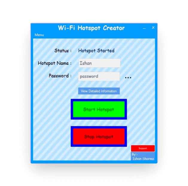
Yep. I still can’t that this was something that I ‘designed’ back then. Notice those gigantic buttons with 10px border blue. What’s a color palette? I didn’t even look up any hex codes! I just wrote ‘blue’, ‘red’ and that’s it.
However, If you think that that was bad..
Look at this one, which I had initially built (but thank god, I never published it).
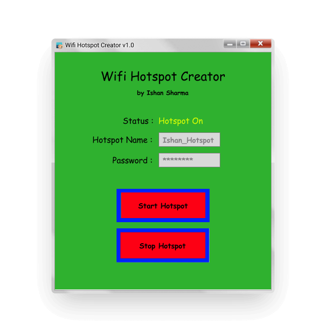
But, what’s wrong with this design?
I mean, it does what it’s supposed to, right?
That’s exactly what I thought back then 😅.
Well, first and foremost apart from the fact that it straightaway looks ugly, There are three main issues, which might’ve crossed your mind.
- For starters, THE FONT. Instead of using ‘Comic Sans MS’, I should’ve gone for a more readable, accessible sans-serif font.
- THE COLOR SCHEME. There’s no defined color palette or anything of that sort in the product. There are so many bold colors used throughout the app. Especially in the primary buttons, apart from the text, there’s no real distinction between the two.
- CONTRAST: You may notice that in some of the parts (for example: the buttons), it’s very difficult to read the text on a dark background i.e. it lacks contrast.
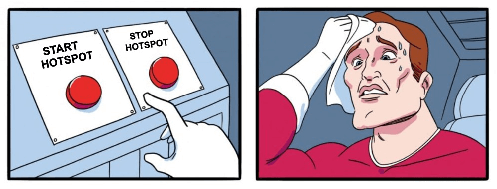
However, while learning how to design most of us tend to focus too much on just the aesthetics of designs, how they look. However, If it’s not usable, even the most aesthetically pleasing design is useless.
This is another key aspect to consider, design is not just about how a product looks, but how intuitive and easy it is to use. Designs should be predictable enough that users are able to intuitively understand how to use them.
For example, If you pay close attention to the Password Input Field in the design above, Once a user has typed a password, there’s no way for him or her to go ahead and retrieve the password.
I encountered this particular thing a lot in my day-to-day use and I always had to go ahead and entirely reset my hotspot password and then update it on all of my other devices. Which was not a functional issue of course, but for a user, it was just, frustrating.
Fast forward to today,
It has been 7 years since I made those mistakes..
I eventually learnt all of these things and developed a sense of design, not by reading books/articles or any theoretical concepts. But, it was just an intution that got developed over the years, after visiting thousands of websites.
Every single interaction on any new webpage that I visited helped me to re-iterate on my understanding of user interfaces & user experience. Similarly, every single time when an interaction within an app felt unnatural or whenever I felt annoyed while using any particular app, I always questioned that why was that the case?
Later on, when I actually read some theory and concepts like Visual Hierarchy, Contrast Ratios, Thumb Zone Rule, Consistency, White spacing etc., all of those things that I had observed and the intution that I had developed over the years all started making sense to me and helped me answer why some things were done in the way there were.
All of this helped me to not only improve my applications and products ofc, but they helped me in ways I didn’t imagine at first. Some of them being:
1. Unicorn Developer 🦄
I first heard this term in one of Filip Hracek’s talks. It’s commonly used to refer to people who can do both design & development. It sounds cool, no? Unicorns have always been portrayed as these magical creatures, be it cartoon shows or Harry Potter films. It certainly feel cool to be called one :)
2. Boosts Creativity
The reason I started with HTML & CSS was because it gave me this huge empty canvas which I could use to create and share my art with anyone in the world. Learning how to design, helps you unlock a super power that helps you to not just create but actually invision those art concepts.
And as I mentioned before, it can have a significant impact on the way you think and approach a problem even in code as well.
3. Effective Communcation
Once you develop a basic understanding of design, it actually helps you to respect and sometimes even question the principles behind why designers make the decisions they do, and this same thing will help you in replicating those designs with pixel-perfection. Nothing can be more frustrating for a designer than to hand over a design for a product feature, only to find that their design was changed significantly by the developer coding it.
4. Understand User Persona
The cool part about design is that instead of just making you focus on what are you building, it forces you to think about why are you building it? This ideology helps you to deeply understand the user behaviour and what they want. Apart from giving you that motivation, that you’re making a change in someone’s life.
In some cases, it could help you to handle all those edge cases in your code which might’ve gotten overlooked and hence helping you in squashing those bugs before they even get to see the light of day.
5. Enjoy your work more
Learning how to design helps in building products that have a perfect balance between the creative and logical aspects and one thing that I’ve noticed is that now I enjoy my work even more! It also gives you the ability to engage in productive conversations with designers, product managers and other stakeholders by speaking their language.
And when you find out that maybe a particular error state was missing in a particular design, you don’t have to annoy others. You can just go ahead and solve it immediately without relying on someone else to spoon-fed you and finish your work without any delays.
If all of the things listed above, weren't cool enough. Then think about this,
Once you gain the ability to do both design & development, It gives you this awesome superpower to build whatever you can dream! It’s kind of like being a one-man army.
You can single-handedly, think, design, develop and publish any app/service out there which you want. Isn’t that incredible?
Okayyy Ishan,
I am convinced. But how do I get started with all this?
Wohoo, So, you’ve finally decided to take this up. Yay, congrats! 🎉 (virtual pat on the back)
There are tons and tons of resources out there. One of my personal favourites is Gary Simon’s youtube channel, DesignCourse. He has a bunch of tutorials on how to use tools like figma, creative challenges, design concepts and how to actually implement them in web.
One advice that I’d give is to learn the basic terminology and initial design concepts first, and then work your way up from there. You can start reading books on design theories, however at the same time, don’t get bogged down by theory only.
Once you feel that you’re comfortable enough to evaluate a design decision on the basis of specific principles, you can move on. For example, just by looking at a navbar, if you’re able to say things like, “The items are too close in size, the logo seems misaligned”, you’re ready to put these skills in practice:)
I’ve compiled down a list of some fundamentals which would help you to get started.
Few Fundamentals
which may come in handy..
Design Tools
The first design tool that I ever used was not really a design tool at all. It was just my chrome browser :)
At that point, since I was most comfortable with writing HTML and CSS code. I used to just straight away open my text editor and code it away, then I’d often play around with different layouts, color palettes etc.
This worked surprisingly well for a while! However, As you can imagine that it quite often this process involved a lot of extra efforts since I had to write code in order to actually visualize what I was thinking and then had to completely get rid of it and start from scratch if I wanted to pivot to something else.
That’s when I decided to explore tools like Adobe XD and Figma. These are dedicated design tools with easy to use drag & drop things and have lots of other handy things such as layers, design systems etc. which helps designers to craft these designs easily.
Most importantly, these tools allow you to actually build prototypes as well which you can use to pitch a concept or visualize and entire end-to-end user flow.
Typography
Remember the odd looking ‘Comic Sans MS’ font that we saw earlier in my app? Yep, that was bad and things like those could’ve been avoided only if I had better understanding of typography back then.
Firstly, different fonts and typefaces have their own features and can make or break the experience. Hence, you should always choose one that better suits your design theme and style. For example, if you’re looking for a font for a cartoon/illustrated website then perhaps a bold, fat and rounded font might better suit your needs.
In order to further enhance the user’s experince, this typography can be combined with two other key fundamentals of design:
Visual Hierarchy
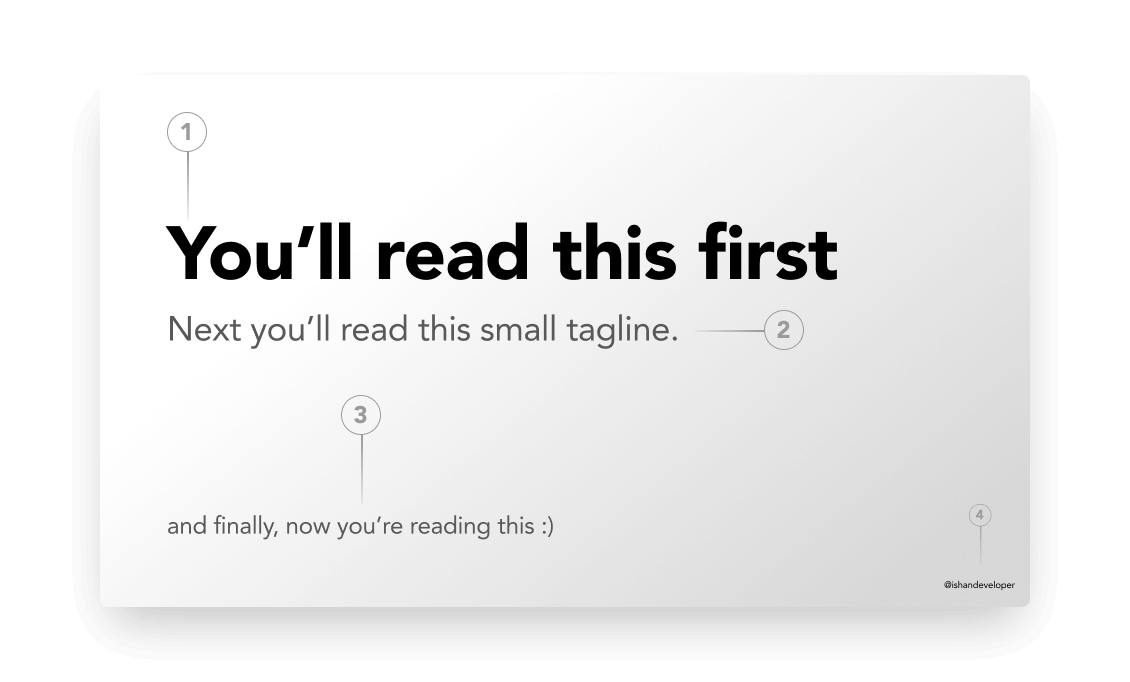
The relationship between different type elements in a design is vital to making that design more usable. A website with a great visual hierarchy will also help users find their information fast.
You can play manipulate different properties of fonts, their weights, size, style (italic or underlined) to create a better visual hierarchy. Headings, sub-headings, titles etc. are some of the examples.
White Space
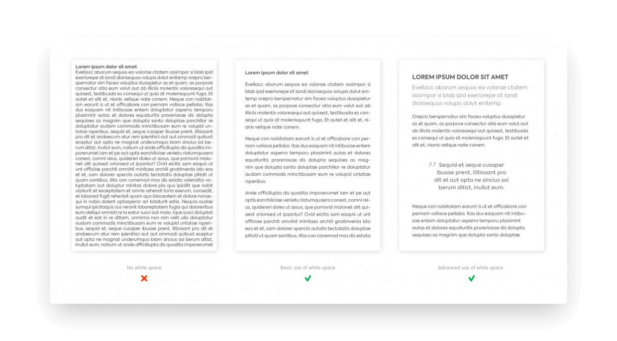
The next principle you can follow is to balance the amount of space and element on the webpage.
Again, adding too much white space may make the UI look boring for users to use and navigate around. On the other hand, not having enough white space is actually worse, since it creates a cluttered and crowded interface, making it hard for users to find the information they need.
Hence, maintaining a balance between these two states is very important.
Colors
Colors play a significant role in any product’s design. Different colors can be used to induce different emotions in a user’s mind, even slight changes in shades can completely shift the visual impact.
One of the design fundamentals is Color Theory, which is a very vast topic and deserves an entire blog of it’s own. However, we’ll discuss a few basic things to know about colors.
The below image represents what we call, a Color Wheel.
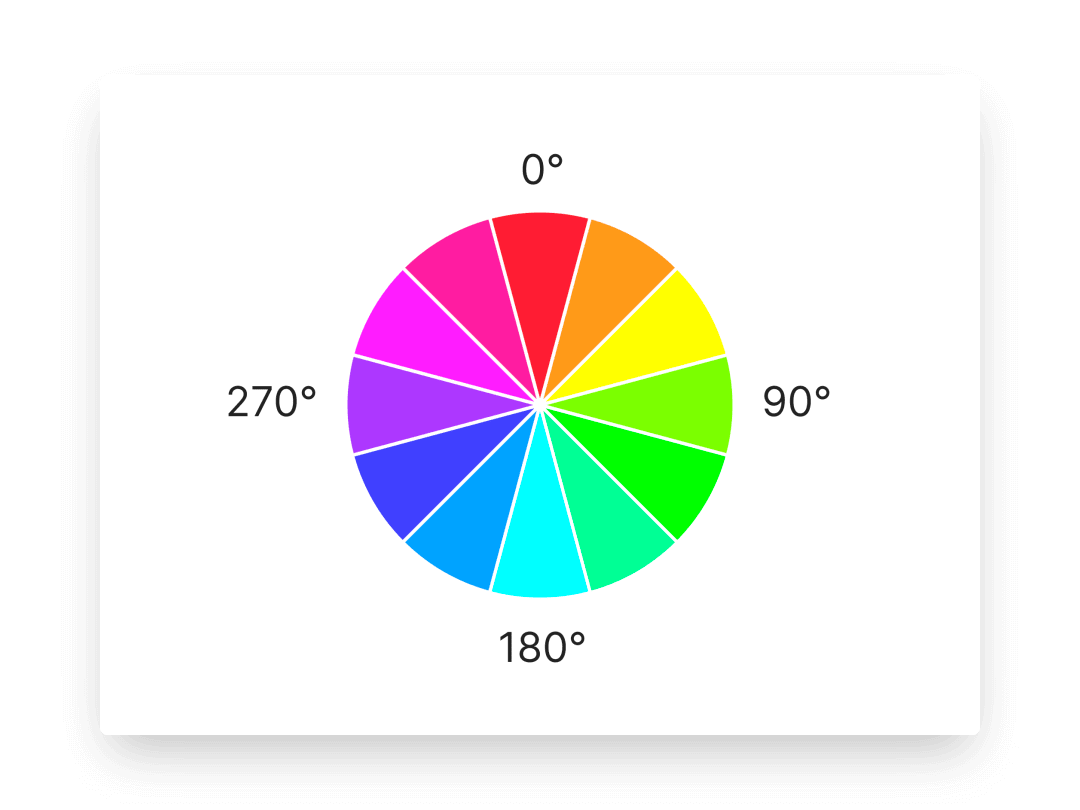
On the basis of this, colors can be classified into various groups with regards to their tones.
Analogous Colors
Analogous means similar and is the name for a group of colours that lie immediately adjacent to each other on the colour wheel. Each of the three colours has one colour in common.
For example: In the above wheel, red-orange, orange-yellow and yellow-green are analogous colors.
Warm Colors
Warm colours are mostly made of Red, Orange and Yellow. They are called warm because they remind us of warm things like the sun or fire.
These colors tend to depict emotions of warmth, security(orange), joyful (yellow), however at the same time danger(red). It should be used carefully. Remember the two giant red buttons in my app, that we saw earlier?
Cool Colors
Cool colours are made mostly of Green, Blue and Violet. They are called cool because they remind us of cool things like a cool forest, a cold lake, sky, air or ice.
Cool colours tend to be psychologically soothing and can actually make people feel cooler because they can slightly lower the blood circulation and thereby decrease body temperature.
Neutral Colors
Neutral Colours are colours that are neither warm nor cool. They are the result of mixing two complementary colours (e.g Red and Green). These are all types of Brown. Black, White and Grey are are also neutral colours.
With enough consideration and thoughfulness, Combinations of these colors, can be put throughout the product to induce different emotions in a user.
For example: Signing up for an app is a positive action hence cool colors such as blue, green can be used. Whereas, deleting an existing account is a destructive action, hence warmer colors such as red is used to depict ‘danger’.
Contrast ratios
Perhaps the most important thing to consider while using any combinations of these colors to be vary of contrast, or perceived “luminance”. It is the difference in brightness between two colors.
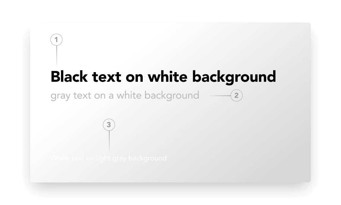
There are plugins in tools such as Figma which can help in determining the contrast ratio i.e. a ratio of the luminance of two colors.
When working on the web, we must always hit at least WCAG (i.e. Web Content Accessibility Guidelines) AA color contrast guidelines, which states that we should maintain
- A contrast ratio of at least 4.5:1 for regular text elements
- A contrast ratio of at least 3:1 for large text elements
- A contrast ratio of at least 3:1 for graphical objects and UI components
Conclusion
If you’re a developer who’s interested in learning more about design, or someone who had no clue about design up until this point. I hope that this was helpful to you in one way or the other or at least motivated you to explore more about design :)
At the end, what matters the most is that you should enjoy what you do :) Get out there and be a unicorn! 🦄
Oh btw, If you are already a unicorn developer or you’re on your journey to become one, do share your codepen / dribbble shots for sure. Here’s mine!